


–>
–>


EasyPadel Special Events
Gogol.
Visible-Invisible
Visible-Invisible
EasyPadel is a platform that simplifies padel court bookings in Dubai and connecting players for matches and tournaments. While I work on the project as art-director, I developed the identity for its seasonal events, including Valentine’s Day and International Women’s Day tournaments. Each event required a unique visual approach while maintaining the recognizable EasyPadel brand. The identity extended across landing pages, event merch, digital advertising, as well as trophies and certificates. The result was a cohesive and engaging experience that reinforced EasyPadel’s brand while celebrating the spirit of each occasion.
Assistant design by Irina Holzer, Valeria Kamenko
->
Assistant design by Irina Holzer, Valeria Kamenko
->


Astrum

A new cryptocurrency, Astrum, is entering the market. Its main characteristics are a high level of transparency, a focus on science, charity, and grants.
Crystals grown from protein on a space station is a perfect metaphor for all its characteristics. As it was synthesized with the help of humans I used the image of a crystal as a symbol of transparency and uniqueness. The key features of the overall style are strictness, simplicity, and minimalism. To connect the image with the scientific theme, I added elements reminiscent of formulas and chemical diagrams.
->


Praxis Hwang Magazin


Praxis Hwang is a traditional Chinese medicine clinic in Switzerland. This magazin offering invaluable insights and tips tailored for clinic patients. The design embodies a disciplined style reminiscent of medical precision, interweaving elements evocative of acupuncture. This approach harmonizes with gentle, natural hues, complemented by welcoming illustrations and photographs. It encapsulates thoughtful curation of layout design and holistic concepts for each issue.
Cover illustration: Ekaterina Nikolaeva.
->
Cover illustration: Ekaterina Nikolaeva.
->


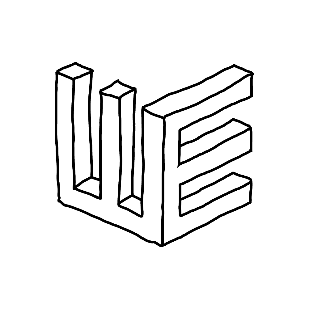
Gogol. Visible-Invisible
Gogol.
Visible-Invisible
Visible-Invisible
A nine-hour festival dedicated to the 215th anniversary of Nikolai Vasilyevich Gogol. The events included performances, lectures, concerts, workshops and discussions, as well as an exhibition dedicated to the writer as an individual. For this event, I and my team of designers created an identity that included navigation, merch, exhibition space, board games, website and social media layouts. We used images of characters from "Dead Souls" by a famous artist of the 19th century. The characters are hidden behind many layers of text's sheets.
->
->


Once Upon A Time In Individuum
"Once Upon a Time in the Individuum: Children, Toads, and Slaves" was a six-hour festival celebrating the birthday of the book publisher "Individuum". The event featured meetings with authors, workshops, a substantial book sale, and a concert by one of the authors. The festival’s identity was inspired by the style of a grand invitation, with postcards from the authors overlaid on top as a gift to the publishing house, each showcasing their respective programs. Navigation, posters, cards, formats for social networks and website were created by me for the fest.
->
->


Forbes Magazine


I worked at Forbes magazine as a senior designer in collaboration with the art director. My responsibilities included creating a new magazine layout design, designing the daily layout of special materials and ratings, and developing a cohesive concept for each issue. I collaborated closely with photo editors, authors of texts, editors, and proofreaders.
->
->


Library Night Festival 2020
Library Night 2020 marked the first major online event hosted by a library during the pandemic. The event featured online interviews with 40 prominent individuals on our VK platform, all responding to a single question: "What will happen next?" The concept behind the event was to use photographs of road junctions as a metaphor for decision-making. I with my design team crafted a pixelated font to symbolize a clear and uncluttered future.
->
->


Monti Fiori


Logo, identity, and branding for Montifiori, a Mediterranean restaurant located in Moscow. This project was a collaboration with an illustrator. The design style is based on the restaurant’s concept and cuisine, which combines playful, light cocktails with the complexity of Mediterranean gastronomy.
->
->


Manor Markoth


Logo update, color identity, brand book, and design of two series of bottle labels. The concept behind the premium series is to blend tradition and innovation, in line with the winery’s ethos. The second series, featuring lighter dessert wines, is built around the concept of gastronomic travel, accompanied by sommelier notes.
->
->


Klyaksa


Logo design for Klyaksa Art Studio. The studio hosts masterclasses on free creativity for children and teenagers. The design embodies the freedom of creativity and activity while maintaining a strict grid, resulting in an original and self-confident look, much like a teenager.
->
->


Gorya


Logo and cover design for the debut album of the independent Russian artist Gorya. Gorya’s songs are a mixture of nostalgic indie pop and harsh criticism of the current reality. In this logo, I tried to combine his desire for something new and the Christian origins of his creativity.
->
->
Ametis by Estima


Catalog design for "Ametis by Estima", a new line of premium porcelain tiles. The samples of materials stand out boldly against a deep black background, creating a striking contrast. Delicate white lines mimic seams between tiles, adding a touch of elegance. The use of an antique font enhances the design's sophistication, catering to the preferences of the target audience.
->
->


Temporary Architecture

The book "Temporary Architecture" is about the architect Alexander Brodsky’s projects. The main section is devoted to five well-known structures that have not been preserved. It also includes articles by friends about the temporary works of the architect. The cover is made of thick kappa board, and the spine is raised. On the front side of the cover, there is an imprint that resembles wooden boards.
->
->


